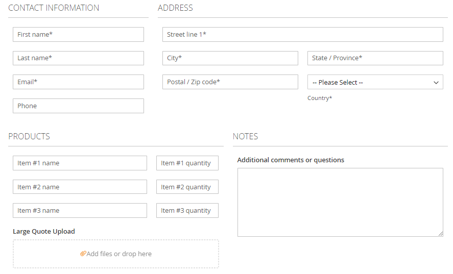
Responsive Form
WebForms Pro M2 allows you to design sophisticated form layouts adjustable to various screen widths with mathematical precision. Your forms will look perfect in all circumstances!
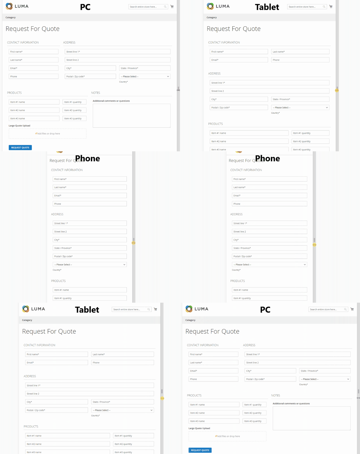
Each field and fieldset has special Responsive Design configuration block where you can set the element width in relation to 3 common screen sizes:
-
Large Large size corresponds to PC or Laptop screens. Its the screen that can hold multi column layouts easily.
-
Medium Medium size corresponds to Tablet size screens. This screen size is suitable for 1-3 column layouts.
-
Small Small size corresponds to Smartphone screens. It is usually used with 1 column layout.
Here is an example of the "Request for Quote" form which automatically adjusts layout depending on the screen size:
Configuration
Fields have Responsive Design settings located in the Design Tab and fieldsets have this block in the main edit page.
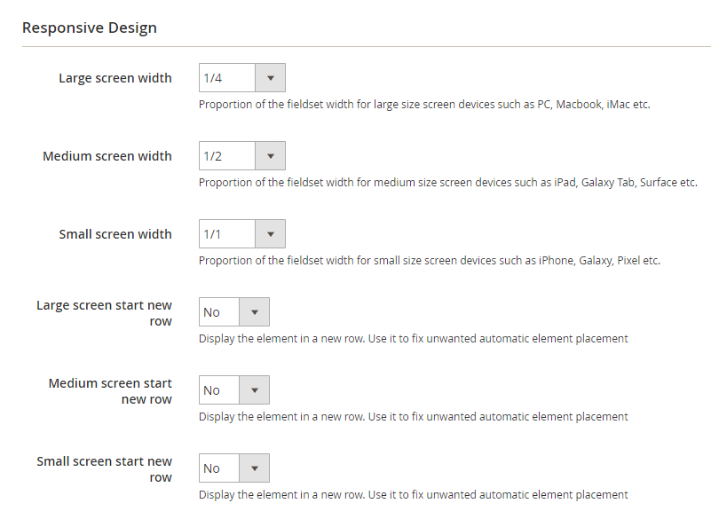
Large, Medium and Small screen width parameters set the desired field width for corresponding screen sizes. The field width is relative to the fieldset.The fieldset width is relative to the whole form width.
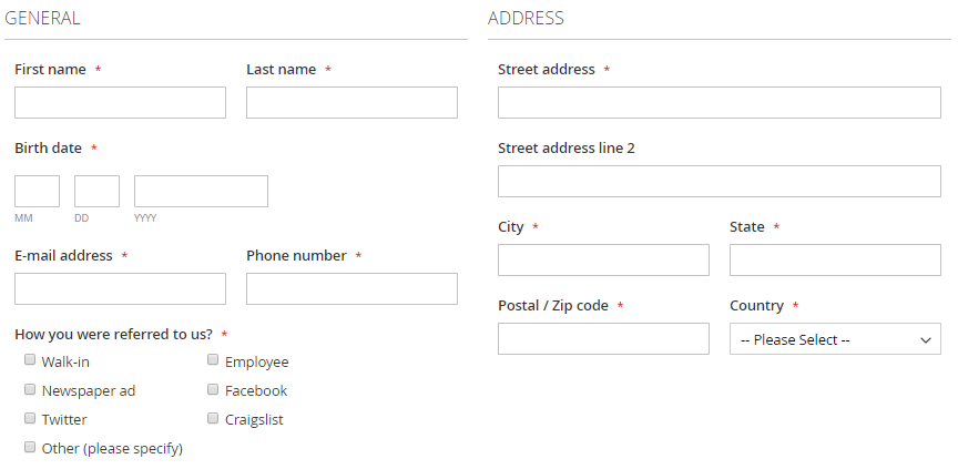
Following width options are offered for fields: 1/1, 1/2, 1/3, 1/4, 1/5, 1/6, 2/3, 3/4, 2/5, 3/5, 4/5 and 5/6. Following width options are offered for fieldsets: 1/1, 1/2, 1/3, 1/4, 2/3 and 3/4. In general, you can create multiple column layouts out of both fields and fieldsets which leaves you with a lot of possibilities!
Here is example of layout with fieldsets width set to 1/2 and fields width set to 1/1 and 1/2:
Incorrect layout fixes
Large, Medium and Small screen start new row parameters are there to solve layout problems. M odern browsers tend to optimize the screen space and automatically place elements. In case when you need a certain field or fieldset to be displayed at the new row you can enable these options.
Here is an example of the automatic element placement that requires a fix:
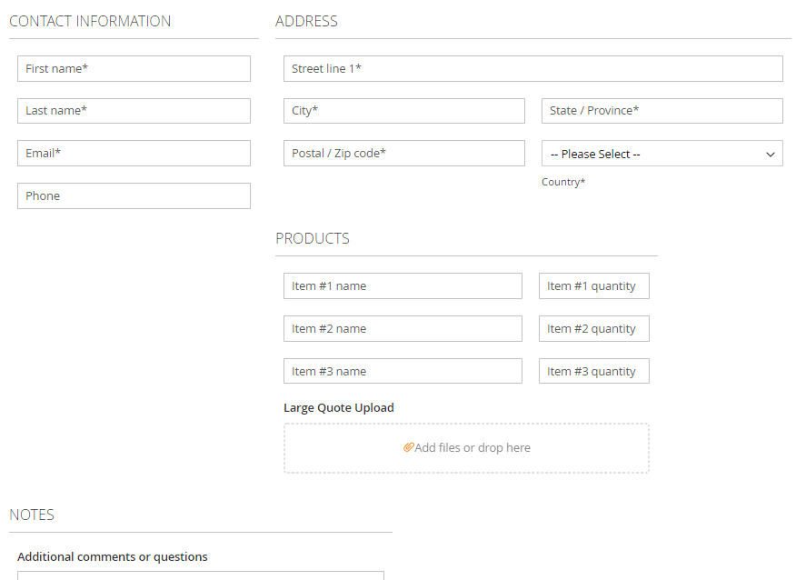
After enabling the Large screen start new row parameter for the Products fieldset the form is displayed correctly:
